Showing posts with label Visual inspiration. Show all posts

Wednesday, 28 May 2014

visual inspiration

For these I did a quick search on pinterest to gain some initial inspiration for where i would like to go with this project, From this search I am thinking that I would like to include other subjects as well as ballet dancers - possibly ice skaters, ribbon dancers or pole dancers.

I would really like to start dancing again.... I (Iris) agree with the above comment. I am 56 and I want to begin again to study creative dance and praise dance! I have included this image because even though it is a chalk drawing I love the way the artist has created a silhouette effect around the dancer and really enhanced the gracefulness through the use of texture or lack of texture in some areas.


#dance #danstheaterwinkel #roosendaalThis image screams strenght to me, that is why I wanted to include it in my visual inspiration, even thought the model is so strong in this it doesn't look masculine. I love the way the photographer has arranged the light to create shape highlights on the model.


Ballerina / Bailarina / Балерина / Dancer / Dance / BalletI Love the pose of this image and how elongated the model is creating her body through the pose, again I like the way the light is highlighting the outline of the model to create a glow. I also like the fact that you can see where she is in the photograph, she is in a theater and it really adds a sense of depth and story telling to the image.


Ballet; ballerinas live for it. we were born to do it. it challenges us. we invest all of our time to this sport. it is the reason for our blood, sweat and tears. it causes us pain and frustration but we still love it. ballet is our passion, our life, and everything to us and no one but ballerinas will ever understand that.✨I love the use of colour in this image, definitely something I want to take into consideration for this project, I also like the fact that she has concealed her identity through looking away from the camera, it adds a mystery to the photo, also where she is jumping and you can not see the floor it makes it look as if she is floating, this is definitely a good idea to create a sense of weightlessness and grace.


Wednesday, 21 May 2014

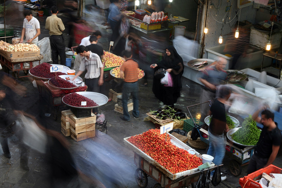
Reza Golchin - Iranian Bazaar

https://www.lensculture.com/articles/reza-golchin-iranian-bazaar#slide-11


Busy of the people, colours, the odd strays that are defying the rest of the worl who are happy to just watch the world go by, these few are the sectators of life, comfertable to go at their own speed 


They havent evern knowtised the effeort he has put in to the persintaion of the produse, that he take such pride in his own work, and they dont care because they are just rushing by, every the people buying arent apperciating the beauty of his workmanship, they just want what they are buying, not the time and effert he has put into the persentationn 


Sunday, 11 May 2014

Pink video

https://www.youtube.com/watch?v=yTCDVfMz15M


After having my only dancer model cancel on me I have been struggling with how to continue with this project, I was just listening to some music on youtube when i came across pinks video for "Try" and I think that this could be a really interesting idea to include into my project, or to at least look into! Tomorrow I am going to do some research to see if other photographers have played with this idea, I think the could be a great avenue to pursue

Friday, 9 May 2014

Ludovic Florent

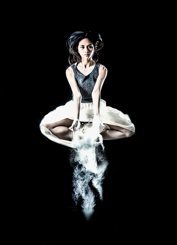
For this series the artist has used a light to the left and above the models head with a dish (I can tell this because there are very sharp shadows falling on the models body) and then a low light on the right hand side of the photographers to fill in the shadows.
I like the way the shadow drops out into the background so you can't see how big the room is and it creates a large spotlight effect, which makes it feel like the model is in her own world.

freedom, escape, celebration, dance, fake clothing, illusion, throwing away her inhabitions, new journy, moving into the fueture, 

defiance, no fear, strength, baring all, proud, explosive, still showing femininity, coacond in the powder, no fear, the dust is shielding her vulnerability to give her confidence to be carefree, daring, to show her form 

 
innocents, pure, baptism, cascading light from the heavens, asking for the answer, reaching out to god, 


Angelic, graceful, feminine, 


Nicholai Go + Victor Gamosa Ursabia Collaboration - Causality

The artist has used 2 lights to create the first 2 images a snoot on her right to create the highlight on the back and a softbox on the left to illuminate her front. The artist has added far to high contrast in post production for my liking, it has taken away alot of the softness and created a masculine undertone.


vortix, balanced, patterned, topperling backwards, unstable, can feel the movement, trying to find her balance, caught in a vortex of movement, spinning, swearling 


trying to break free but being pulled back into the darkness, trying to escape, anguish on her face, she shows stregth but how much streght does she have to have to be free?  


Tuesday, 22 April 2014

Exhibition arrangement

So now that I have been given my space for showing my work and my prints have got back from the printers I have a bit of a problem the end right one in my final arrangement is too dark by the feet and it has thrown the balance of the image completely off (I have edited the image below using the burn tool in photoshop to show how I have received the print) Also looking at my prints I feel that one of the images that my tutor advised me to take out of the series is actually stronger than the end right image now so I am considering swapping this one out for another. 

I have created a template in photoshop using a quick photo I took of my space so that I can more accurately see how the images could be arranged. 

I opened the original photo of the studio spot i had (I had placed paper the size of the prints on the wall before so that it would make it easier for me to size correctly)
I then "placed" one of my finals into the image.
After that I used the perspective tool to adjust the image to a more realistic (This tool is really handy, all you have to do is move the corner markie and it automatically stretches or compresses evenly on both sides)
This is after I used the perspective tool, it is now in a more realistic position and shape.
To finish I used the free transform tool to compress the image sideways so that it really looks realistic
Finally I repeated the process for each of the images to create the set.
Here is the final 3 possible arrangements